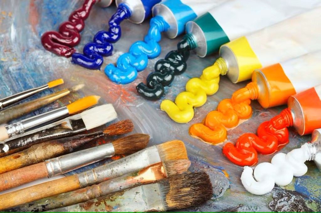
My 12 Essential Acrylic Paint Colors
- Titanium White – An absolute must-have for mixing, highlights, and variations in tone.
- Mars Black – Necessary for contrast, depth, and shadows—without it, everything feels flat.
- Primary Yellow – Pure yellow base to mix warm tones, greens, oranges, and everything in between.
- Primary Red – The foundation for all vibrant reds, pinks, purples, and even warm browns.
- Primary Blue – Key to deep blues, purples, teals, and cooler tones—it’s fundamental.
- Burnt Umber – Earthy brown for natural shadows, landscapes, and mixing neutral tones.
- Raw Sienna – A warm golden-brown, essential for skin tones, landscapes, wood textures.
- Ultramarine Blue – A rich, deep blue, amazing for cool shadows, water, sky, and mixing great purples.
- Cadmium Orange – Bold, warm energy that pops and mixes beautifully with reds, yellows, and browns.
- Cadmium Green Light – Perfect for lush greens, foliage, vibrant highlights—I’d need something lively!
- Alizarin Crimson – A deep, wine-like red, essential for rich shadows, florals, and moody tones.
- Dioxazine Purple – A luxurious deep purple, brilliant for dramatic effects, blending, and artistic vibrance.
Why These Colors?
✔ Versatility – I can mix almost any color I’d ever need using this set.
✔ Depth & Vibrancy – These colors let me create light, shadow, energy, and atmosphere with ease.
✔ Timeless Appeal – These aren’t trendy shades—they’re fundamental for almost any painting style.
With enough skill and mixing precision, primary colors can create nearly any shade, but having *convenient premixed colors* streamlines the process and ensures consistency in tones
Why Keep Additional Colors?
✔ Mixing Takes Time – Having ready-to-go shades like Burnt Umber or Dioxazine Purple saves time when working on large-scale projects.
✔ Color Strength & Pigmentation – Some colors, like Alizarin Crimson or Cadmium Orange, have unique undertones that are hard to replicate perfectly with mixing.
✔ Consistency in Palette – When working on a series or detailed artwork, having consistent premixed tones ensures uniformity across pieces.
✔ Avoiding Muddy Colors – Sometimes mixing too much leads to less vibrant, slightly dull tones—having true color bases prevents that.
When to Rely on Primaries?
✔ If You Have Limited Space or Budget – If you only have the primary colors, strong mixing technique can still achieve nearly everything.
✔ For Experimental Color Blending – If you’re exploring new shades, working from primaries teaches deeper control over pigments.
✔ Minimalist Approach – Some artists love the challenge of using just primary colors for full paintings.
In choosing the 12 essential acrylic paint colors, I balanced versatility, efficiency, and artistic impact. While primary colors allow for mixing nearly everything, having convenient premixed shades ensures vibrancy, consistency, and time-saving precision—especially when working on detailed projects.
This selection covers light, shadow, warmth, depth, and mood, making it a powerful core palette for any creative work. Whether sketching dynamic characters, crafting landscapes, or exploring nostalgic themes, these colors provide a strong foundation for limitless creativity.
What do you have as your essential 12? Let me know in the comment.


Leave a Reply